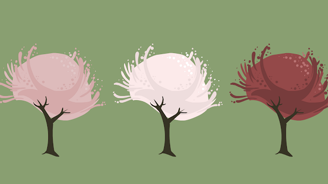
Above are illustrations of my favorite trees as part of a study I'm doing. They are about the size of an asset in an iPod app. I'm interested in illustrating assets for mobile games, and I wanted to know what works when you're scaling an illustration down drastically. It really comes down to shape and color, but I wanted to try it for myself.
Here they are again, a little larger and labeled. The blobbier forms really seem to translate when scaled down, whereas the more detailed branches in the cherry tree are lost.
Here are the original drawings at the size I illustrated in. You can see how blobby and rough they are. It was weird for me to work in this style, making big unrefined shapes, but I found that they really work when scaled down a bunch.
I'll be interested to try illustrating and scaling down other types of assets. Houses and people will be an interesting challenge, as all of the colors and shapes that make them up will have to be greatly simplified.


No comments:
Post a Comment